ZocDoc
Category
Branding Identity
Client
ZocDoc
Case study of the ZocDoc project from concept to execution
Credits
Lead Animator
Curtis Brown
Logo Design
Wolff Olins
Info.
I was tasked with doing all of the initial Zee character animations. Bringing the simple Z to life, showcasing a range of emotions while keeping the designs as clean and simple as possible in order to translate well at all sizes and platforms from the app to full site.
KEY DESIGN ELEMENTS
Always-changing logo. Meet Zee, a line drawing of a dynamic letter Z and two eyes that evokes an always-changing patient face. In resting pose, Zee is friendly and warm – eyes open with a subtle smile shaped by the curved foot of the Z. Other Zees are cheeky (with a smile and a wink), feel meh (with a zigzag mouth and downturned eyes), or are puzzled (with an S-shaped mouth and open eyes).
Animation with Zee out front. The redesign takes Zocdoc’s animated heritage in a new direction, favoring animated patients over doctors with Zee as the face of every patient. Oversized, full frame images distinguish the style.
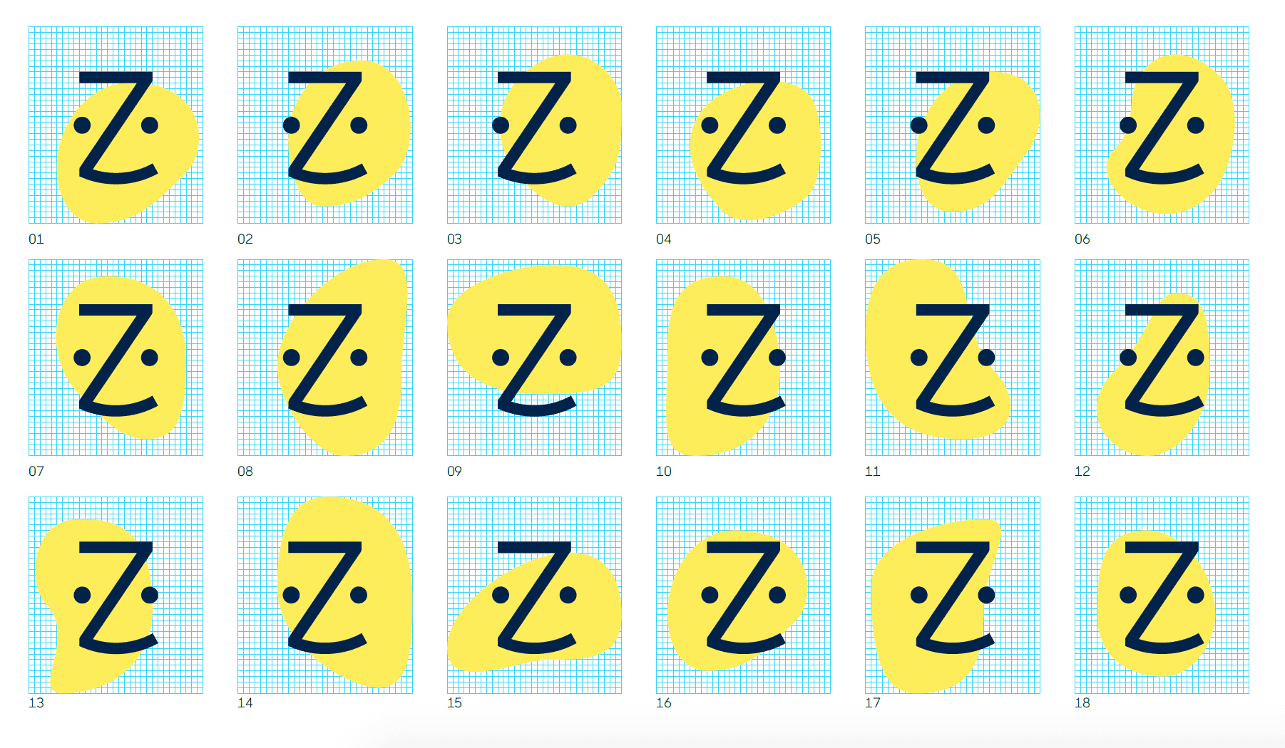

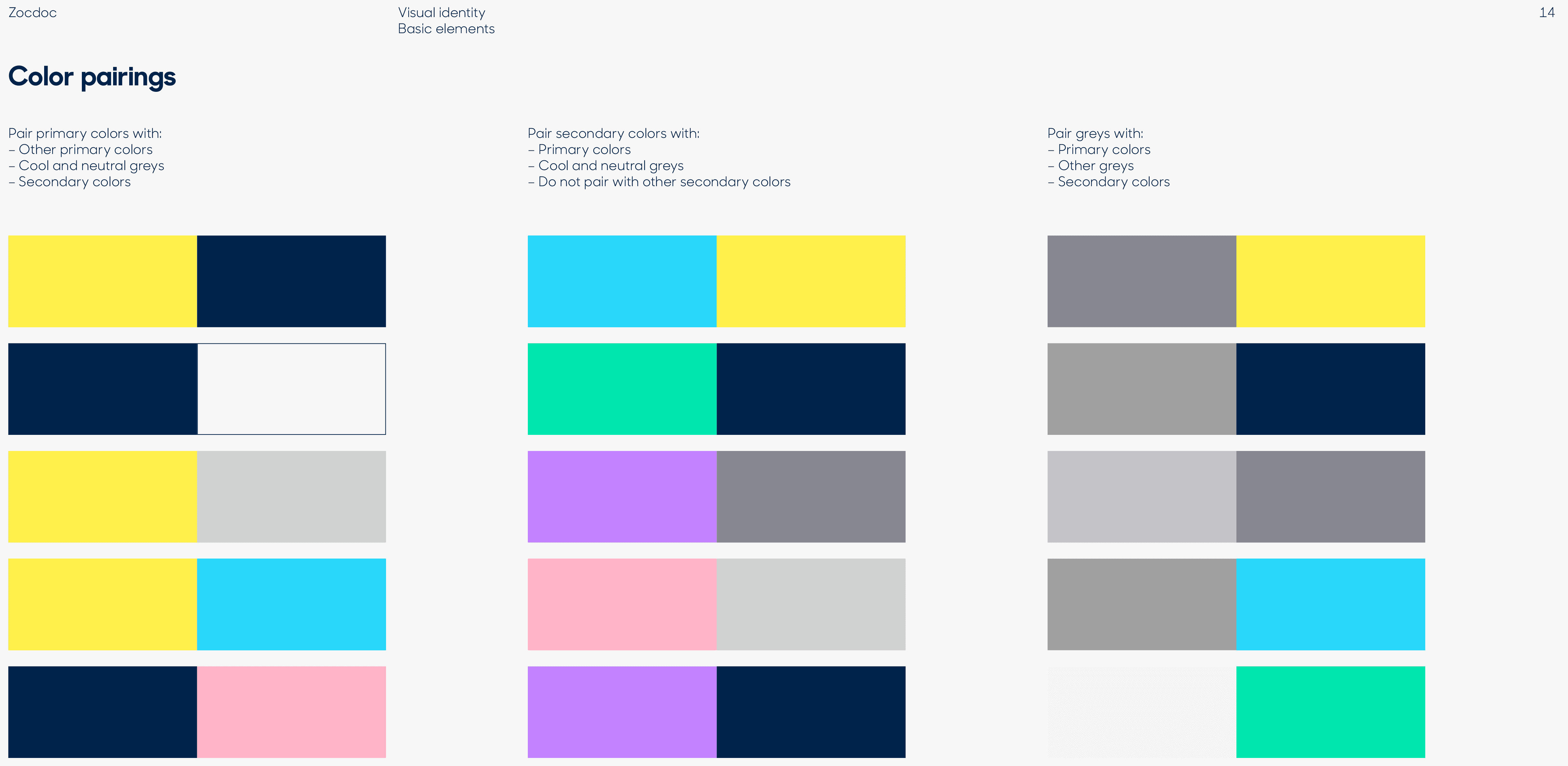
Optimistic color palette. Healthcare has the blues, quite literally. The stalwarts of medicine over-index on the blue and green side of the color wheel. With this rebrand, Zocdoc is taking the bright spot of optimistic and warm yellow. Accent colors in the new palette are saturated pastels and vibrant tonal primaries.
Modern imagery. Real life finds its way into the Zocdoc design lexicon for the first time with rich-hued, slightly humorous and true-to-life photography of patients’ day-to-day – a modern Norman Rockwell style. A germy elevator ride anchored with Achoo? Find a doctor. A positive pregnancy test and surprised couple titled with Surprise? Find a doctor. An ever-harder squint at a book with Blurry? Find a doctor.


